
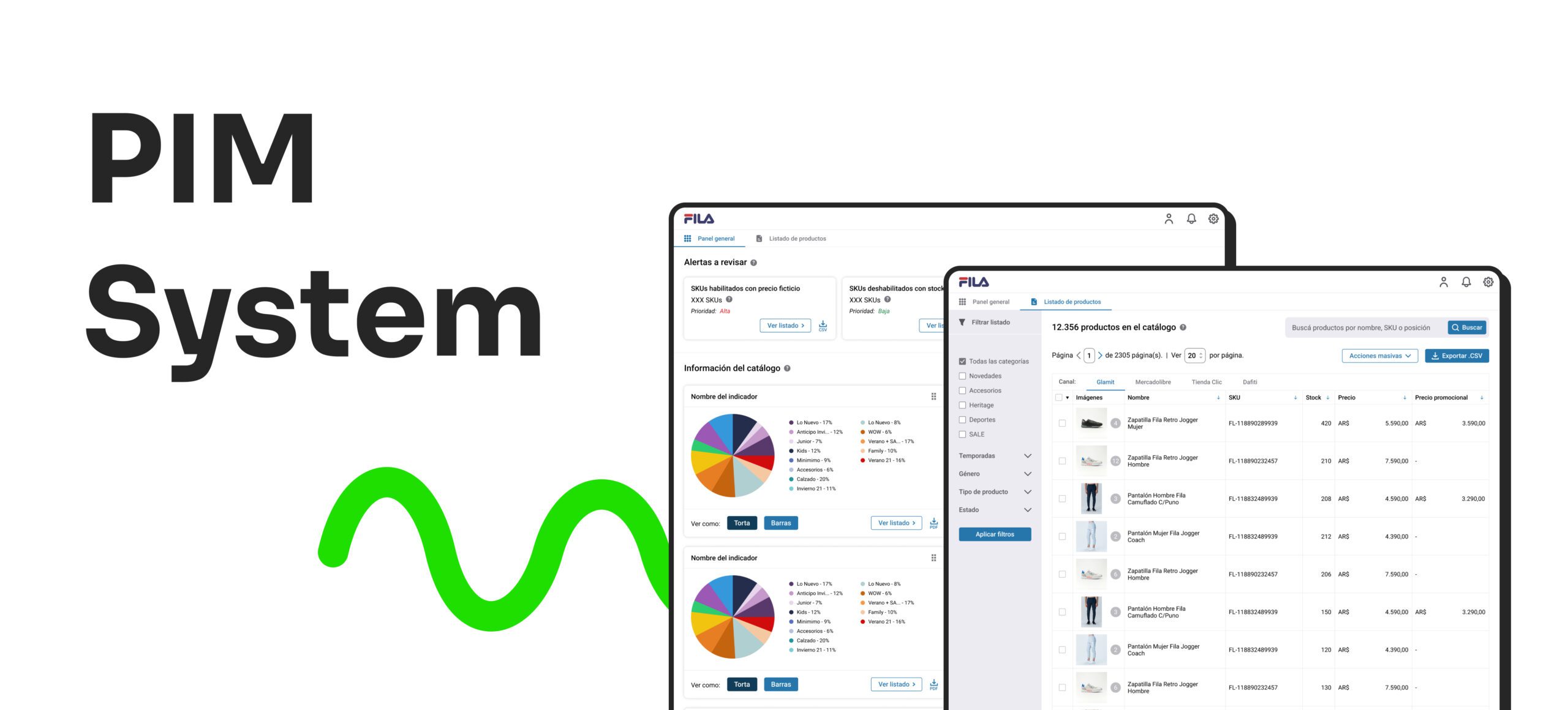
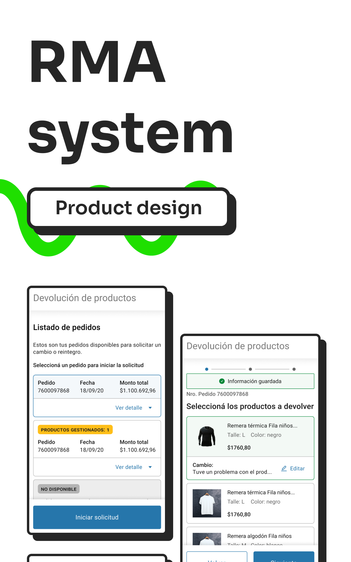
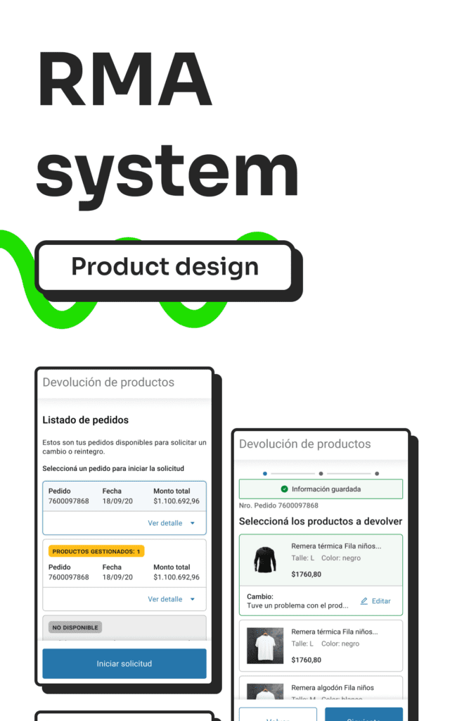
PIM System
8 min. read
Case study detailing the research and design process for the company's own Product Inventory Management (PIM)
Generative research Qualitative research CRM Design
Project length
4 months
Output
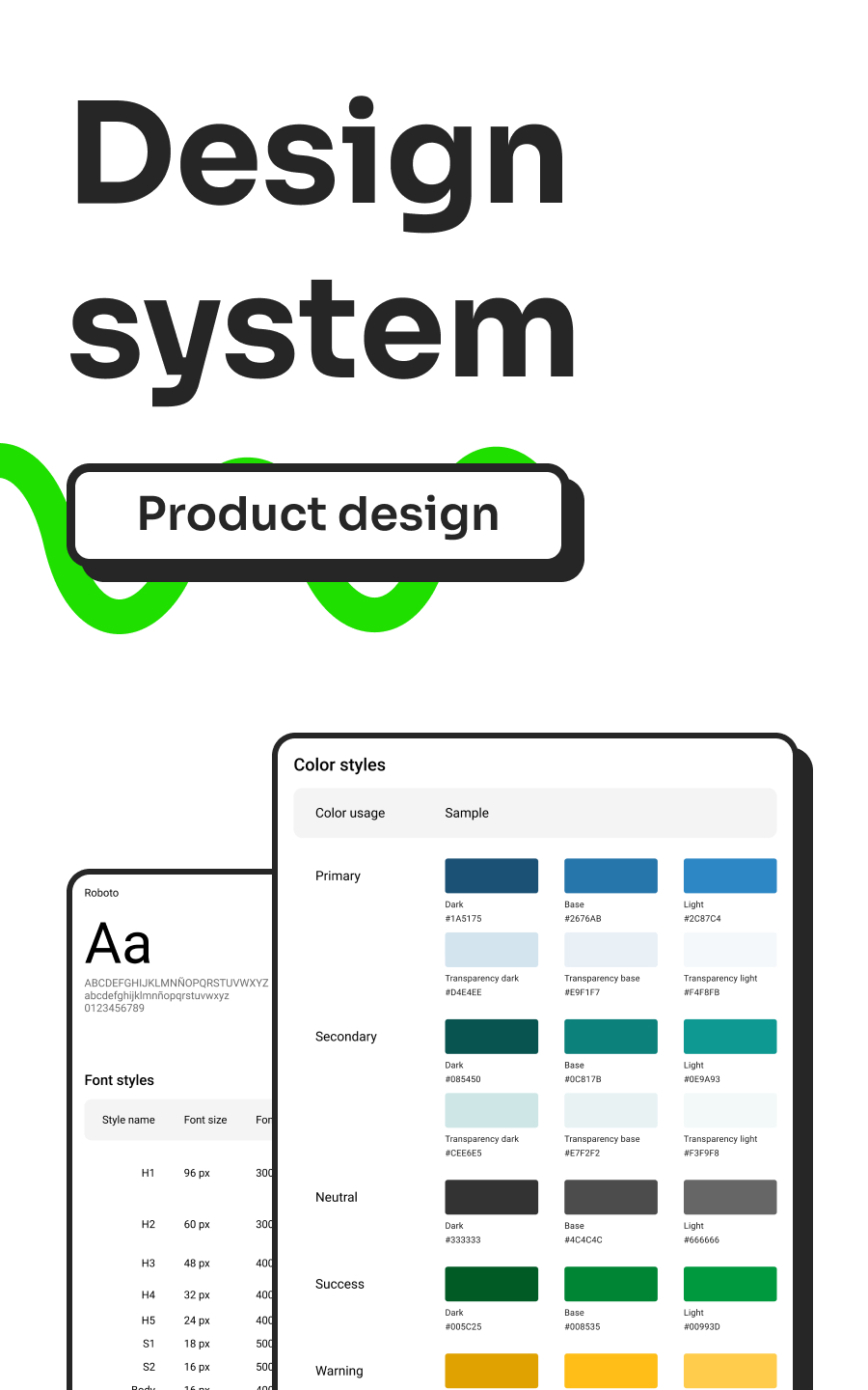
Userflow, User report, Wireframes, High fidelity prototypes
My role
UX Researcher
One of the Product team's objectives centered around replacing third-party systems with in-house solutions. Following the launch of the RMA self-managed application, I took on the research and design of the Product Information Management (PIM) system.
Before diving into the design process, thorough comprehension of the PIM system, our user demographics, their requirements, and daily operational procedures was my priority.
Understanding the userflow
In order to gain insight on key features and understand the standard user flow I benchmarked similar products. My objective was to analyze different types of solutions; some that had the same scope, some that were made for bigger scales and some that had a completely different score. The products I benchmarked where:
- Tiendanube
- Wix
- Plytix
- Saleslayer
To gain a deeper understanding of the processes conducted by both the Catalogue team and the Brand Analysts team, I engaged in two activities:
- Shadowing: This allowed me to comprehend the user flow and provided valuable insights into certain features and quality-of-life improvements, facilitated by direct feedback from users.
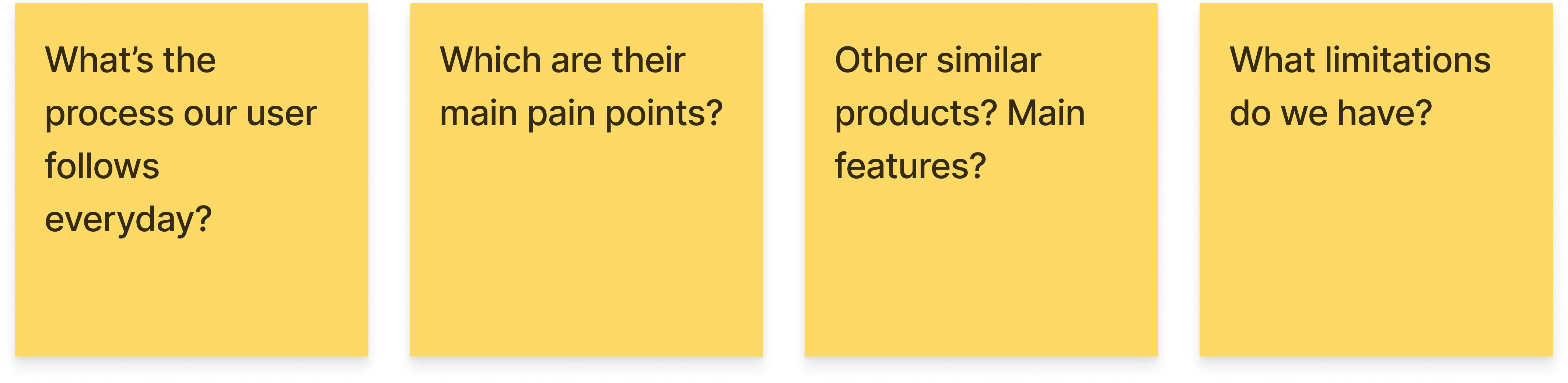
- Contextual interviews: These interviews equipped me with comprehensive data to map the existing user flow. They also highlighted key features and common pain points.
Pain points
- The upload process involves several unnecessary manual steps.
- The length and complexity of the process demand a high level of attention for each task.
- Some tasks, like renaming files or reducing media sizes, require the use of third-party software.
- Changing the catalog structure requires substantial time and effort due to upload limitations, and the restriction to perform only one upload at a time.
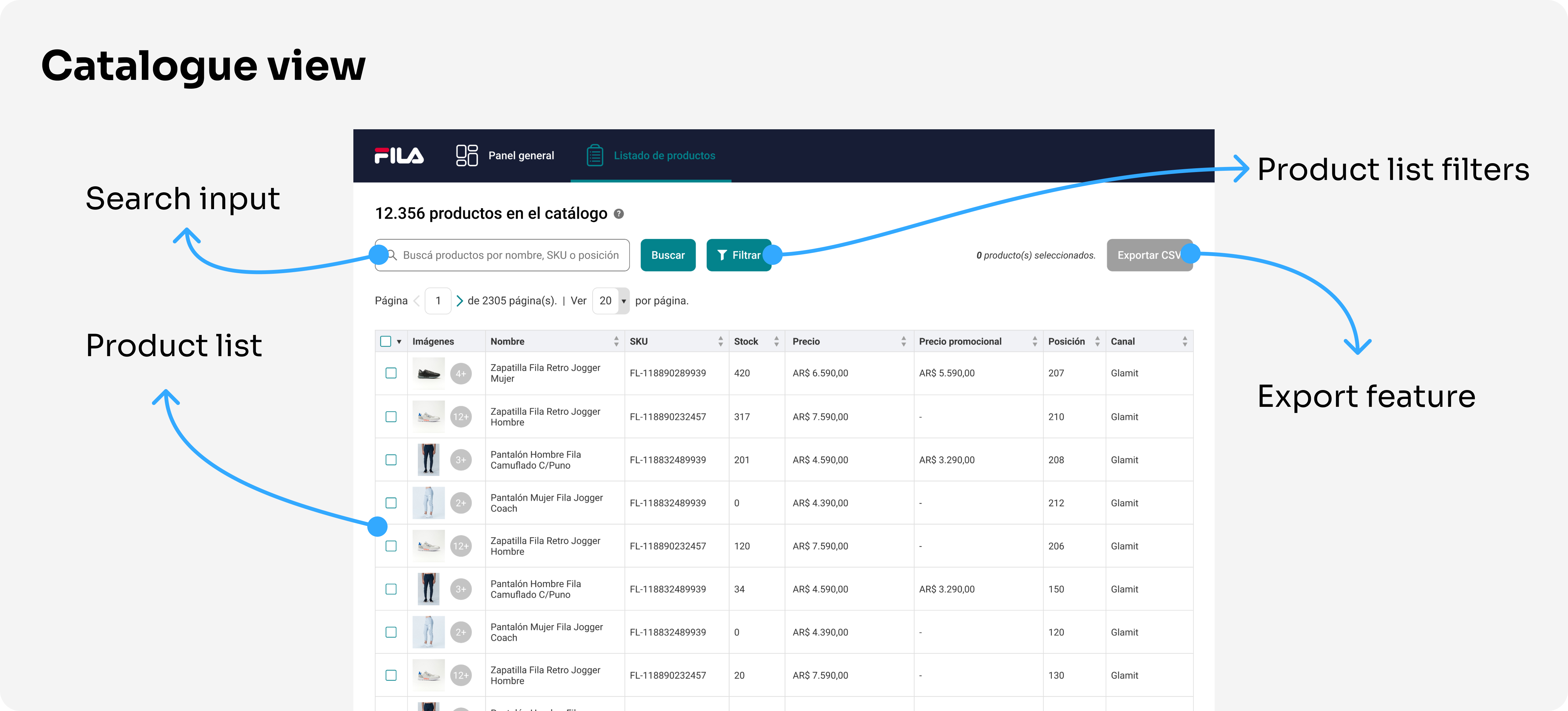
Process mapping
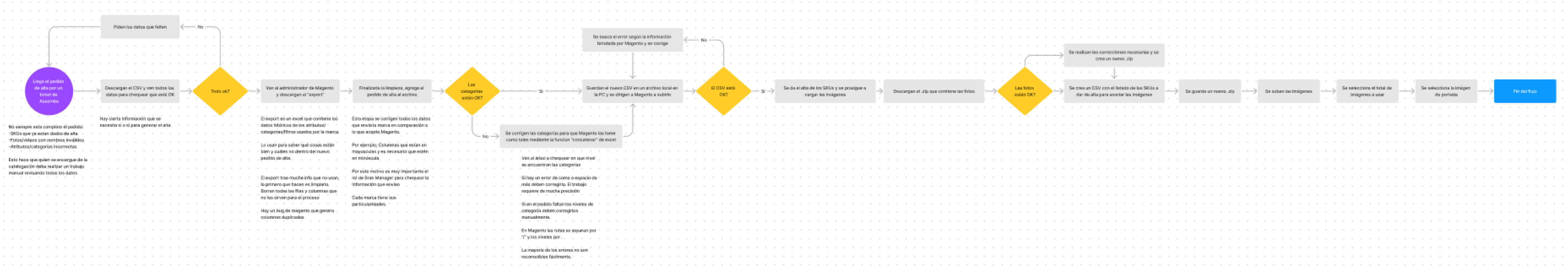
The process consisted of a single extensive flow with several features that our users didn't need, resulting in complex navigation.
Minimum viable product
The solution must be:
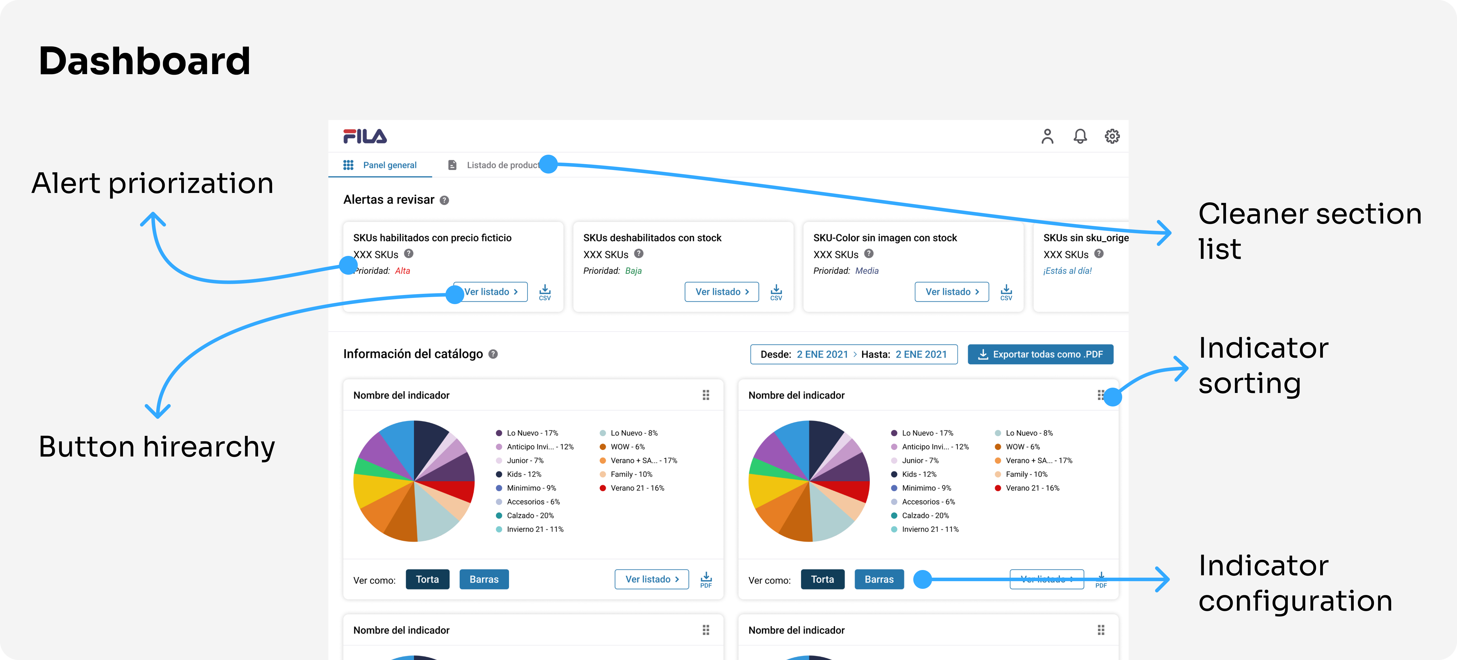
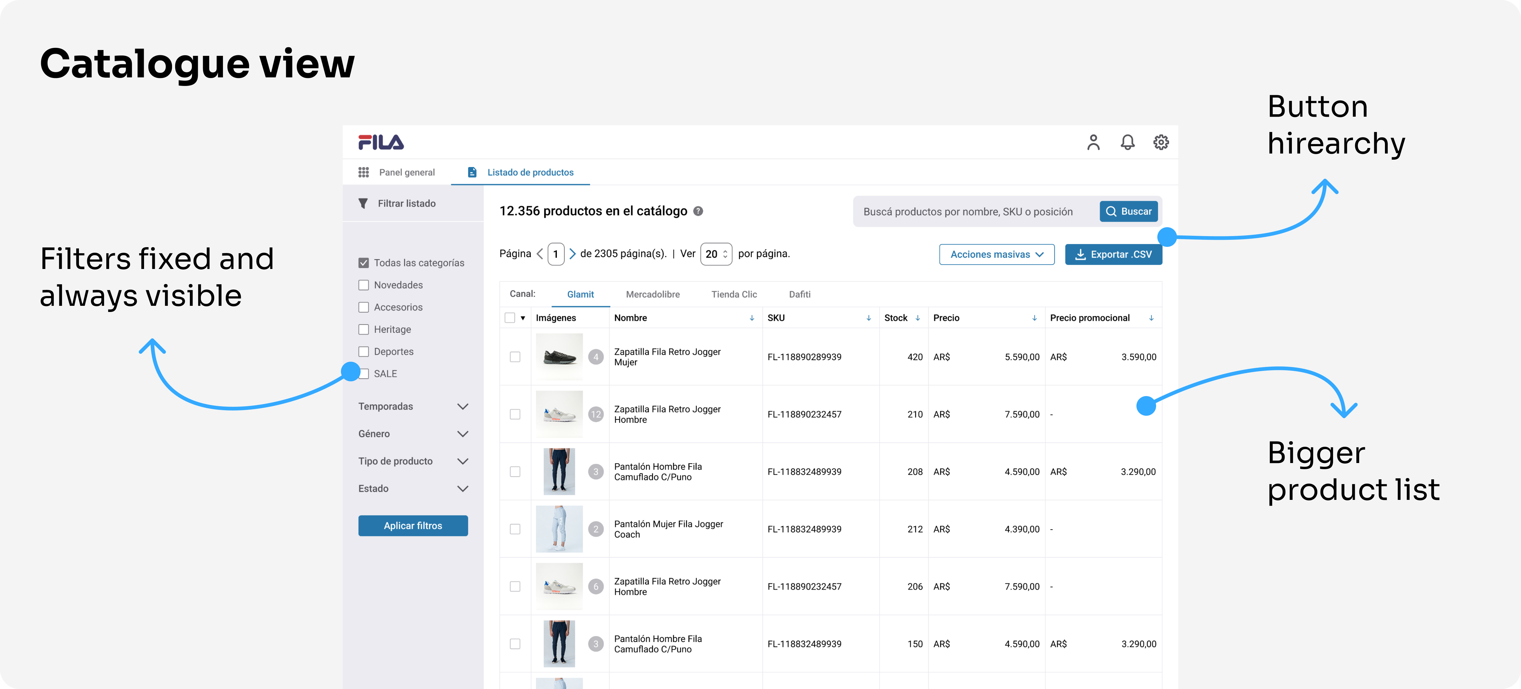
- A user-friendly and easy-to-navigate interface for visualizing the brand's catalogue
- Listing quality indicators to help users assess the quality of their product information
- Notifications to alert users of any problems
- The ability to perform mass modifications without requiring extra steps
- The ability to upload product CSV files
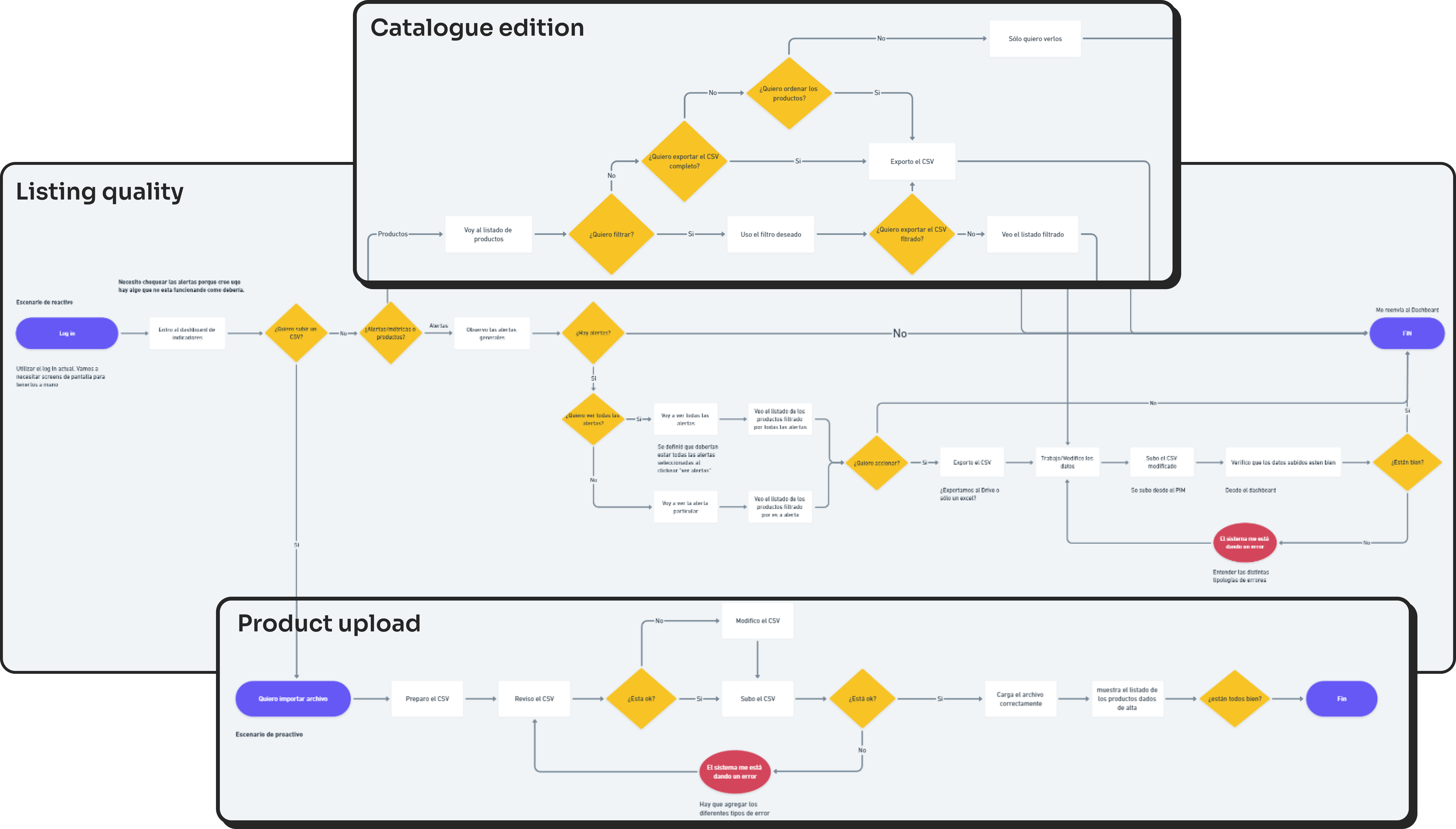
The outcome included a primary feature focused on listing quality, accompanied by two secondary functionalities for Catalogue editing and Product upload.
Wireframes
To initiate the ideation process, I proposed organizing and conducting a Crazy 8 workshop as a creative brainstorming session.
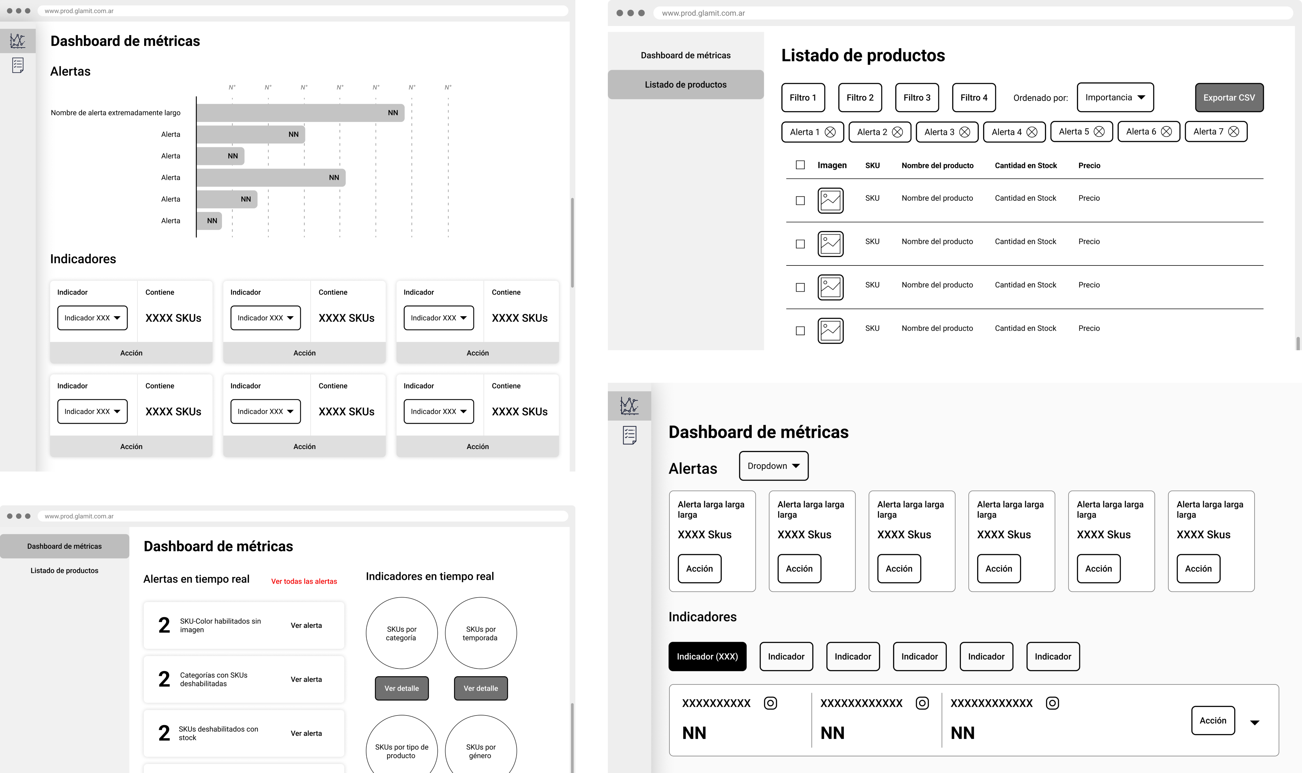
During the workshop, I discovered diverse opinions on the desired features and functions of the PIM system. Additionally, I recognized the necessity to delve deeper into researching the required information for the catalogue view.
To gain insight into user expectations regarding information retrieval, I conducted a hybrid card sorting exercise. This exercise granted users the freedom to add new cards, aiding in a comprehensive understanding.
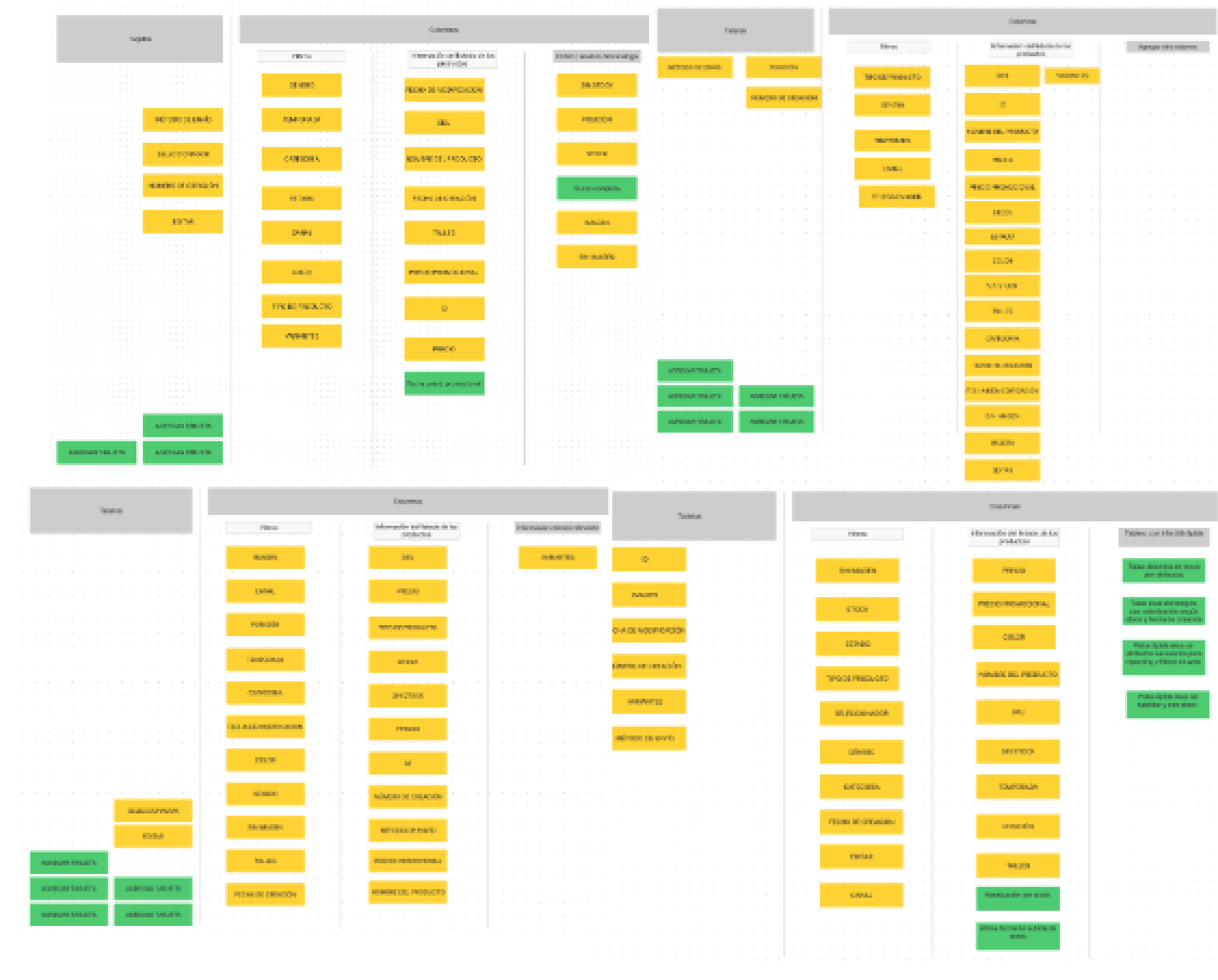
Insights
- There were inconsistencies in the way terms were named between teams
- Users expected to find most of the information within the filter feature
Validations and usability test
To validate the design, I recruited specialists from the Catalogue and Brand Analyst teams. My goal was to understand the impact of the quality indicators and how users use the catalogue.
Through this process, I discovered that the quality indicators were generating friction, as users reported feeling pressured by them. I realized that I needed to be careful in the way the alerts content design to avoid overwhelming users.
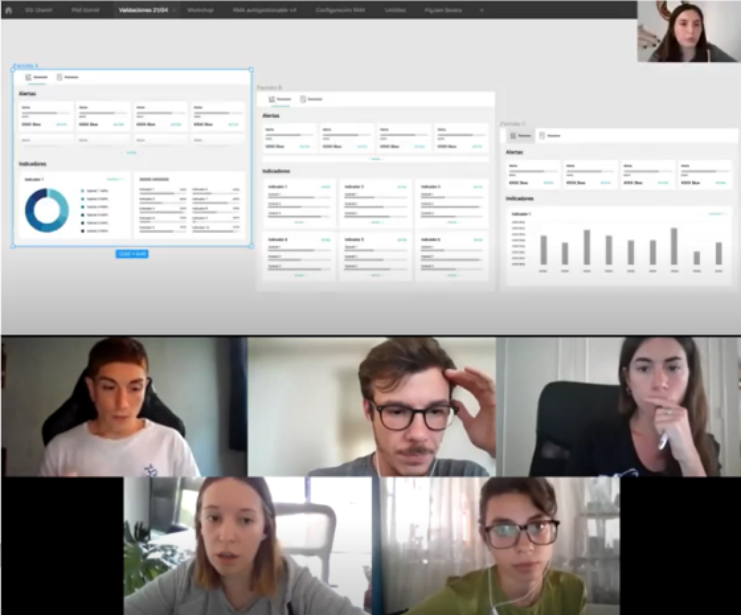
After preparing the first prototype, I made all the necessary arrangements to begin the usability tests.
- H1: The way the system communicates alerts is crucial in making users aware of issues without causing them to feel pressured.
- H2: Incorporating familiar elements from the old interface will have a positive impact on the learning curve and adoption of the new system.
- H3: The quality indicators will enable users to take action where needed without having to fully delve into the catalogue.
Results
From the usability tests, I was able to confirm that effective alert communication was crucial. However, I also discovered some unexpected results:
- Some of the old interface patterns I tried to incorporate into the new design were causing confusion among users.
- The multitude of elements and colors used in the design were generating friction and negatively impacting user response.
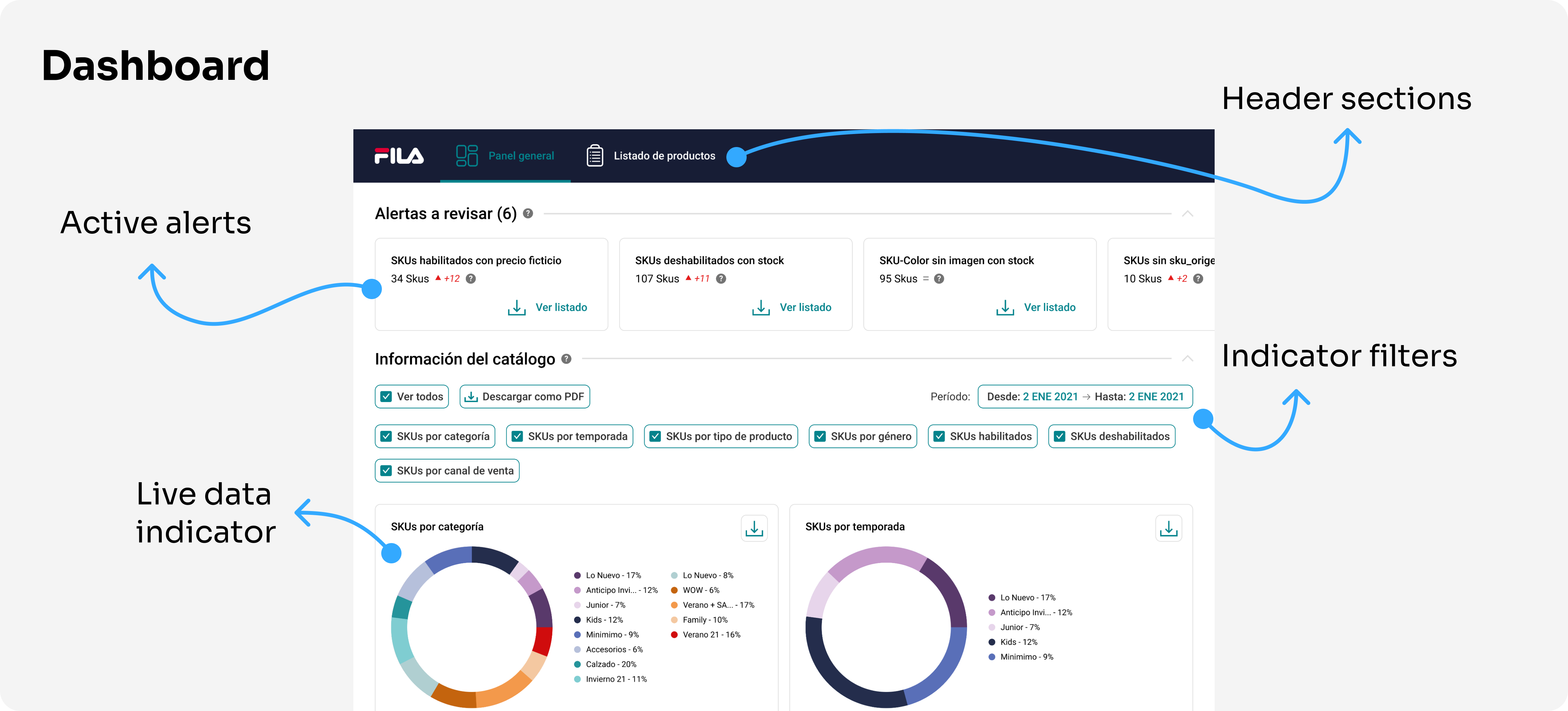
Final iteration
Project conclusion
Regrettably, the project was halted due to a company merger, preventing the deployment of our final solution stage.
Nevertheless, the process proved invaluable, offering us a deeper understanding of the complexities involved in crafting a comprehensive solution.
